


The shop window design color importance
Color is a key element in the visual communication code. Also, it plays a very important role in the shop window design, it can influence the emotions, communicate messages and sensations to our public.
We know that a good window design is essential to attract the attention of potential customers and to communicate the personality of the brand and its products.
When we design a shop window, the color can highlight or make an element more discreet, it helps to create weights and balances in the composition, illuminate or darken. Definitely, it bring life to the work.
We must also remember the color is not only the element that illuminates the shop window, but it is the link between the client’s need, what the fashion designers and marketing want to communicate, making it the definitive reagent for increase public transit inside the store.
The main combinations can be divided into two groups: harmony or contrast. While we can divide the colors into warm and cold. The first ones are reds, oranges and yellows while among the cold colors we find the blues and greens.
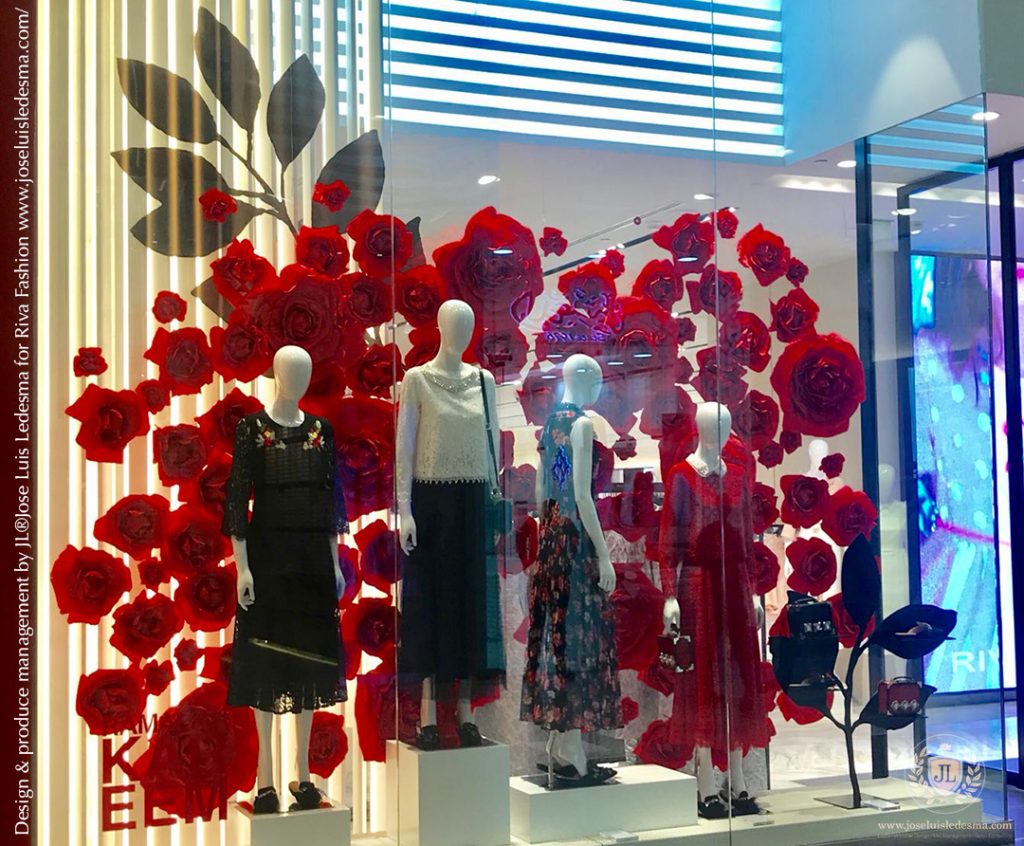
In shop window compositions, the ideal is don’t choose more than three colors, although there is no limit to the nuances. The nuances is the mixture of colors that help generate complements and harmonies in the palette.
When choosing the color palette for our design, we must have considering the concept, the thematic, the products, the style, the type of clientele and the season.
We will analyze in detail the meanings and sensations that each color represents.
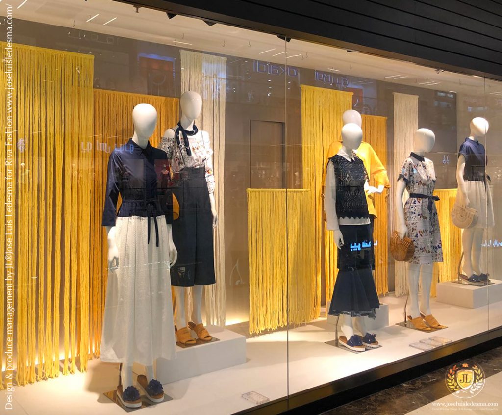
Blue: is associated with calm and serenity. The lighter shades create open environments. The dark ones are reassuring, they represent strength and health. They are associated with the spiritual, wisdom, rest, sea, sky, space and freshness. It is often used in companies and banks for its favorable predisposition.
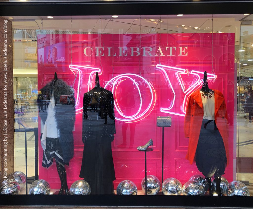
Red: awakens and stimulates stimulates the senses. It is associated with heat, fire, passion and love.
Orange: it’s a strong color, radiant, with a warm character and with very positive vibrations. It can be stimulating or warm, ideal to put attention to details.
Yellow: it’s the brightest and warmest color that the eye perceives more quickly. Strong yellow accentuates, attracts attention and illuminates. In large quantities it produces an over-stimulation, the sensation we perceive is of activity and dynamism. It’s considered the color of the sun, light and gold.
Green: it’s a color that is associated with spring, freshness, nature and hope. It can be sedative and relaxing. The paler greens give a feeling of spaciousness while the darker greens are associated with wealth and abundance.
Violet: a color with mystical airs and noble in its deepest tones. It’s associated with femininity, sadness or melancholy. The paler ones are florid and refreshing, it can be used as a color accent achieving interesting effects. When it tends to purple become more charismatic.
White: elegant light and refreshing, depending on the combination. It’s sobriety, cleanliness and clarity, expresses peace and purity. When combined with a color, it exerts an empowering power. It also transmits feelings of distinction and refinement. It’s usually used for luxury products.
Black: noble, eternal and elegant. It depends largely on other colors that are used next to it. It’s also widely used as a background when you want to highlight the colors of the decoration itself much more.
Rosa: a soft, romantic, fantasy, delicate and tender color. It suggests intimacy and has feminine connotations currently.