


The psychology of color: the masculine and feminine

The psychology of color is a fundamental tool for the composition of a window display, since it allows us to tell stories and create attractive and harmonious designs.
It is important to pay attention and understand the meaning of each color, what represents and what effect would have in the commercial statement that we want to deliver.
Colors can convey feelings, emotions and messages to us, using them consciously is the key to a winning design.
The psychology of color has to be studied and analysed in every design strategy. Many important firms and companies already use the psychology of colour to reinforce the message of their campaigns, their products or to effectively reach the profile of the customer they are targeting.
Colours are essential to define the composition of any shop window, to create balance, manipulate the perception of objects and the sensations we want to transmit to the customer.
The way in which the color is applied in the design of a shop window will completely alter the final result, so colour is a truly important.
There are some accepted and shared concepts regarding colour, applied in both sides West and East. Understanding their meanings will allows us to be accurate in the application of color and its psychology. For this reason, it is essential to study its history and live its culture.
Do colours have gender?
As we have commented previously, there are many social conventions at a global level around certain colours, but at the same time, there are many subjective aspects in the psychology of color that will cause the same colour to have many interpretations and meanings in different cultures, historical times or parts of the world.
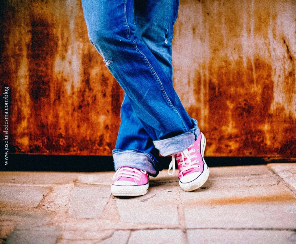
There are colours that are used today differently if we compare them with the use they had in the past, such is the case of pink and blue.
Currently, we are used to associating the color blue with the masculine and the pink with the feminine, but this has not always been the case.
The use of pink for girls and blue for boys is a relatively new concept if we compare it with time ago framed in each historical context. In fact, traditionally, blue symbolized for many centuries, the feminine, linking water and the sea. The opposite of this element is fire, red being assigned to the masculine.
What about pink?
“Reformist fashion”
Pink color is associated today with the feminine world, however, until 1920s, was a masculine color. Before this decade, the indicated colour for girls was white or blue. For this reason, as Eva Heller explains, in her book “The Psychology of Color”, we can see male children of the aristocracy or the Child Jesus dressed in pink in ancient paintings. Among many other very interesting references centuries ago.
In fact pink, is in the range of the color red, it was denominated by the old Babylonians “like blood”. It is a more intense and stronger color for this reason and since it’s related to the color red it looked more suitable for male children. While blue, which is more gentle, was associated with girls.
During the 60s, in the retail world, baby clothes remained in neutral tones until the 80s, when genderless garments disappeared to recover the idea of boys in blue and girls in pink.
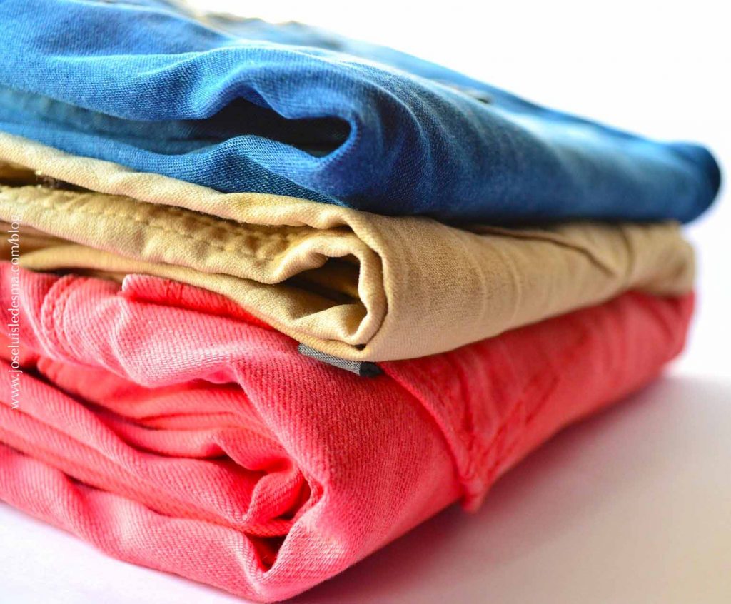
Today, the color pink continues to have different connotations and interpretations around the world. In Japan, for example, it serves as a nostalgic symbol of the slain samurai, perceived as a masculine and gloomy color. In Korea, it is interpreted as a sign of trust and in Germany it has a character of tenderness, pacifism and sweetness.
Another masculine color par excellence is red, the color of strength and activity that is associated with fire and blood. But there is also a typically feminine red in religions close to nature: dark red, a color symbolizing the state of fertility in women.
Red is the color of happiness in China. For example, red eggs are a typical gift related to births and are a symbol of happiness in life. As well red envelopes with lucky money for the New Year.
There is much more to read about the power of colour and single colour psychology. It is clearly a way of expressing oneself, through art and culture, which are constantly changing along with society and its historical context. As a result, using all the necessary data of a determining color in our designs, we can convey very important and effective messages.
For this reason, the knowledge of the Director of Window Display Design and Visual Merchandising department has to be rigorous and go much further than what is shown at first glance to be able to play with the symbolism of decoration and the psychology of colors, in order to have more impact on the work, which is essential for the success of each project of each company.
Sources: The Psychology of Color de Eva Heller. www.pinkisforboys.org, artsy.net.